Tuesday, December 13, 2011

Week 16.

Last blog for the Semester!
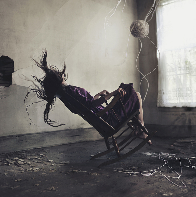
For this last blog I'm going to post three images from my three favorite photographers.

Ralph Eugene Meatyard
This is one of my favorite photographs by him. The selective focus is beautiful, but not only that but the quality is beautiful from the film, and the dark and light tones are incredible. The contrast between the different branches and the way the branches lead your eyes into the picture, and through the entire image as a whole. The way the branch curves also adds to this photograph. 


Michael Kenna
I have really been interested in square-formatted photographs recently, and this photograph is my favorite photograph that Michael Kenna has taken. The fog that flows through the trees is incredible, and also very beautiful. The feeling of nostalgia in this photograph is very strong, and this photograph is very emotional for me because it reminds me of events from my past. I love how the trees reach out to the skies as if they are in agony, and this feeling is brought out by the fog.
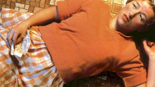
Uta Barth
Uta is also another one of my favorite photographers and has given me a lot of inspiration. Even though this photograph is simple, it becomes incredibly complex in its simplicity. The light coming from the windows is incredible, and the shape of windows also adds a lot to this photograph. The edge of the room and the line of the floor is incredible as well, and the dull colors in the photograph flow together very nicely and form as one. 

Tuesday, December 6, 2011

Week 15.

Nan Goldin
Photo Source

I found this photograph to be absolutely beautiful. The way the figure is positioned in the water is incredible and very emotional, like the figure is becoming one with the water that is surrounding him. The color of the water is also really incredible, and how all the colors mix together very nicely. The composition also adds a lot to this photograph.


Max Waldman
Photo Source


I was immediately intrigued by this photograph because of the tones and the positioning of the figure in the frame. The way the figure is reaching up and how his legs are positioned make it seem like he is falling from the sky. The light coming up from above reminds me of a "fallen angel", or someone reaching up to become closer with the skies above even if they are so far. The dark and lights of the image really adds a great deep emotion to the photograph, and the surrealism of the image does as well.


Amelia Oakley
Photo Source

I have been following her work on Flickr for a really long time now, and the way that she pairs people and house or a building is absolutely incredible. The figure and the building always go hand in hand and the color palette remains the same in each image or flows very nicely. I love the way the light from the windows of the house emit a strong glow and how the blue in the image of the house is reflected in the image of the figure. Her work is very surreal but incredibly beautiful, and reminds me of film stills.

Tuesday, November 29, 2011

Week 14.

Helen Levitt
Photo Source

This is one of my favorite photographs that Helen Levitt has ever taken. The composition of this photograph is incredible, especially how the one woman on the left is hovering over the other. The expression on the faces of the people in the photograph are so emotional, and you can tell they are all in deep thought. Their emotion adds emotion to the picture and adds great depth.


Jerry Uelsmann
Photo Source

I instantly got drawn to this photograph when I was going through Uelsmann's work. The tones in this photograph are beautiful and I love the way the light from the sun sweeps over the car cover to create shadows. I also really enjoy how the figure in the water mimics the car and the position of it, and how the boy is covered by water, and the car is covered as well. The reflections in the water are also really beautiful.


Alexis Mire
Photo Source

I follow Alexis Mire on Flickr, and I absolutely love her work. This photograph is one of my favorites that she has taken, and mostly because of balloons through the window on the bus. The composition is really great, and the lights on the bus really bring the viewers eye into the picture. The surreal aspect of the balloons in the bus is really incredible, and not something you see all the time. The moving car going out of frame is also a really nice touch.

Monday, November 21, 2011

Week 13.

Ken Rosenthal
Photo Source

Rosenthal was actually one of the photographers that inspired me for my final project this semester. This photograph is one of my favorites from his work. The fogginess and also softness from the out of focus quality of this picture is what intrigues me the most. I love the way the picture fades in from white all the way to the black out of focus plants in the center of the frame. I also like that the picture is cropped in a square format which frames in the subject better. The way the photograph is blurry gives me a feeling of being inside of a dream.


Nadar
Photo Source

The main aspect of this photograph that really intrigued me was the surrealism that is involved. I love how this photograph was set up to make it look like this man was flying in a hot air balloon in the sky, as he is looking down at the earth. Since the photo is old you can tell that this photograph is staged, especially because of the lighting, but the quality and sharpness of this photo are incredible considering how old it is.


Salgado
Photo Source

I absolutely love the vantage point of this photograph. I also really love the motion used to show how the crowd of people is moving, and I also really like how the viewpoint of the camera gives the viewer an easier way to view the whole station and all of the people getting off of the trains and boarding them.

Tuesday, November 15, 2011

Week 12.

Minor White
Photo Source

The first thing that I really loved about this photograph was the darkness of the sky, and how light the clouds look against it because of the film or filter used. I also like the composition and how the bush in the left hand corner of the photo leads the viewers eye into the rest of the picture to view the house, the trees, and the sky. I also really enjoy the shadows and how dark they are on the house in contrast to the light that is coming through the trees.


Koudelka
Photo Source

My initial attraction to this picture was the composition and how this photograph looks very surreal to me. I love the curves in the lines that are in this photograph and how they mimic the curves of the earth, and the road as well. I also really love the fogginess of the photograph and how the landscape fades into the background because of how foggy it is.

Alexey Titarenko
Photo Source

I first saw his work in Craft when we were looking at examples of blur. This photograph of his is my absolute favorite. The tones in this photo are absolutely incredible, and there is a dark feeling to this picture as well because of those tones. The way the hands are somewhat visible along the railing of the stairs is very powerful. The movement of all the bodies is very smooth, but the fact that all the bodies have become one mass gives a different feeling, a heavier feeling.

Tuesday, November 8, 2011

Week 11.

Lauren Greenfield 
Jennifer, 18, at an eating disorder clinic, Florida
Photo source

This photograph is a part of her 'Girl Culture' series. When I was looking through the series this photograph immediately caught my eye, especially because of the title. The colors that are used in this photograph are paired together perfectly, and the fact that it's a cloudy day adds to the mood of the photograph. The expression on the girls face also adds to the feeling of the photograph, and the way her arms are placed can give the viewer and audience a better knowledge as to what this girl is going through as she struggles with her weight.

Nicholas Nixon
Northeast Court, Tennis Club of Albuquerque
Photo source

I immediately fell in love with the composition and perspective of this photograph. I love how my eye goes directly to the tree behind the corner of the tennis court. The way that he used the corner of the court to lead your eye into the photograph is amazing. I also really like how the horizontal lines of the net mimic the vertical lines of the fences, and the windows on the houses in the background. The tonal range of this photograph is also beautiful and soft in a way. The lightness of the tones adds a dream-like feeling to this photograph, and the darker portions of the clouds at first gave me the impression of mountains in the distance.

Hiroshi Sugimoto
Polar Bear
Photo source

I have always really enjoyed Hiroshi Sugimoto's work, and when I saw this photograph I was instantly in awe. I love how the photograph leads in from white to gray to bring your eye down to the subject. The smooth quality of the tones is beautiful and looks completely unreal. Even though this is a photograph of an exhibit, Sugimoto made this exhibit incredibly serene and when I first viewed this photograph I thought the animals and scenery was entirely real. The way he can mold a subject to be entirely his own is amazing.

Tuesday, November 1, 2011

Week 10.

Harry Callahan
Chicago
1948
Photo Source

I love the repetition of the windows that is used in this photograph. The abstraction is also very nice and flows throughout the entire frame. The way the windows shift in position and the way they bend in and outward is incredible and adds a lot of beautiful surrealism to the piece. I also really enjoy the different sizes and shapes of the windows, and really makes me feel as if this is something from a dream of mind. The light and the way that it is used through the windows over the black background is amazing as well.


Edward Steichen
Gloria Swanson
1924
Photo Source

I have always enjoyed the moodiness that was involved in Steichen's work. The dark tones really add incredible emotion to his photographs and they become really beautiful with the added emotions. After seeing his work at the Met, I became really intrigued by his photography and the manner in which he shot his subjects. With this photograph in particular, I love the way he used the lace to make it look like it was a double exposure, or sandwiched negatives. The lace also adds great texture to the womans face, and the image as a whole. The dark tones and dark eyes add great aspects to the image as well.


JoAnn Voburg
Photo Source

A friend of mine showed me JoAnn's work. She mainly shoots using diptychs, triptychs, etc., and I absolutely love how she can turn something simplistic into something really beautiful. I love how the tree flows throughout the three frames, but loses focus in some areas which causes me to feel like I am running through this field under the tree branches. The way the light is used through the leaves is remarkable as well, and the use of depth of field is great as well.

Monday, October 24, 2011

Week 8.

Ralph Eugene Meatyard
Untitled
Photo Source

I have always been inspired by Meatyard's work, but after viewing his work in person when our school went on the trip to New York City, his work inspired me even more. His tonal range is absolutely fantastic, and his use of contrast is incredible. The print quality is also spectacular, and I love the use of blur and motion in several of his photographs. Each one of his photos holds a surrealistic aspect to them. This photograph in particular really grabbed my attention. I love the use of motion to distort the image, but how you can still make out specific objects, like the small child amongst the trees.

Steve McCurry
China
Photo Source

I have a friend who is absolutely in love with Steve McCurry's work, so I decided to look more into what he does, and his work is incredible. This photograph was one of the first ones that I saw that really pulled me in. I love how one person is to the side of the photograph out of focus, which leads your eye into the photograph to find the man running on the building. The colors add to the photograph as well, especially since the earth, and the buildings around them only have muted colors, but the outfits they are wearing are very saturated and bright. The composition of this photograph is amazing as well, and like I mentioned before, the fact that the one man to the side of the photo is completely out of focus, adds a lot to the picture itself.

William Eggleston
Atlanta
1980's
Photo Source

The first thing that really grabbed my attention in the photograph was the colors. All of the colors are very dull, and the majority are simply earth tones, but the way they all work together, helps the photograph greatly. The horizontal lines that are made by the wires mimic the lines from the windows on the buildings and creates a frame within the photograph. The car leads your eye into the picture, and the pole in the foreground that is out of focus adds a lot and leads your eye in as well.

Monday, October 17, 2011

Week 7.

Siebe Warmoeskerken
Photo Source
I follow this Siebe on Flickr, and his landscape photography is spectacular. I have become really fascinated with photographs of great distance and space involving landscape, and I find this to be really beautiful. The space between the sky and the mountains in the distance and then  ground is incredible. I love the atmospheric prospective in this photograph, and how the landscape almost looks like a painting. The composition is incredible as well, and how the colors fit together perfectly. 


Brassai
Photo Source
The main thing that really pulls me into this photograph is the fog and how the lights look underneath of it. I also love how you can see the reflection of the lights on the road because it may have rained before this was taken, and that definitely adds a lot to this photograph. I also love the fact that the lines on the road help the audience know where the picture was taken, or relatively close to the area/country where this photograph was taken. The lighting is incredible in this photo, and how the streetlights lead your eye farther into the picture as they disappear into the scene. This photograph is beautiful and gives off a very quiet feel, but also lonely. 


Alexander Rodchenko
Balconies
1925

Photo Source


The geometrical shapes of this photograph is what first attracted me it as a whole. I love way the lines of the building lead you up to the sky, and the tone of this photograph and contrast is perfect. The darks aren't too dark, and the lights aren't too light, especially since you can tell that this photograph was taken on a cloudy day. I think that since this photograph was taken on a cloudy day, it adds more emotion and feeling to the photograph itself. 

Monday, October 10, 2011

Week 6.

Andre Kertesz
Distortion - 1933
Photo source
I have always been fascinated with how images can be distorted or altered using simple objects such as mirrors. I was initially attracted to this photograph because the woman in this photograph is being distorted in the mirror to add a different feel to the photograph altogether. The composition of this picture is amazing, and the in way in which the camera is placed makes the woman's reflection look not human, even in the least bit.


W. Eugene Smith
"Country Doctor" Series, 1948
Photo Source
When I saw this photograph, and the series title, I immediately made the connection and felt that the title of the series added a lot of depth to this photograph. The composition is spectacular, and the range of tone is incredible. I also really like the fact that the "doctor" is in mid-step, and in a somewhat awkward position. The fact that it looks like it's going to storm by the way the clouds look in the background adds a lot of questions to where this picture was actually taken, what time of year, and what exactly was going on with this weather pattern.

Garry Winogrand
Utah, 1964
Photo source
I was instantly drawn to this photograph because of the final project I did for Photo 1. The fact that he took the photograph inside of the car which I have done many times before made me much more intrigued to look deeper into this picture. The use of decisive moment is incredible. The fact that he caught an animal running across the road in this picture is amazing, and adds a lot more to this photograph as a whole. I also really enjoy the fact that the windshield is a bit dirty to add texture.

Monday, October 3, 2011

Week 5.

Albert Watson
Car Park, Gold Coast, Las Vegas, 2001
Photo source

I have seen Albert Watson's work prior to doing this blog assignment, but I haven't seen his landscape work. I absolutely love his landscape photography and how he makes a photograph taken in the past 10 years or so, look like it was taken decades ago. His tonal range in this photograph is absolutely incredible, and the contrast is very effective as well. The fact that he added a vintage vehicle into this picture adds to the illusion. With his color photography, the color range is fantastic to give you a sense that the photograph was taken decades before it actually was.


Jacob Riis
Blind Beggar
c. 1890
Photo source

I read into Jacob Riis and what influenced his work. After reading about his influence and why he took photographs I was really intrigued by his work. Riis was influenced by the poverty that surrounded the world, mainly where he was living at the time. Riis even discussed the seriousness of poverty and how it should be solved. I think that the way Riis touched such a serious matter through his art is absolutely incredible. The title of this adds to the depth of the picture. The fact that the man is blind adds a lot of emotion to this photograph, and I believe it's very powerful.

Loretta Lux
The Wanderer
Photo source

I have never seen Loretta Lux's work before looking up her photographs for this blog assignment. I love the surrealism she applies to portraits. The photographs look like paintings mixed with cut outs from newspapers and magazines. The way the photographs she makes and manipulates turn into something entirely different and begin to look like a separate medium is remarkable.

Sunday, September 25, 2011

Week 4.

George Tice. 
Water Tower, Rahway, New Jersey, 1994.
Photo source
As soon as I saw this picture I was immediately attracted to the  contents. The first thing I noticed was the perspective and the composition. The composition is absolutely brilliant, and I love the way the tree mimics the shape and flow of the water tower. I also love how they are both alone, but in that loneliness both of these things come together in the way that they are placed. The water tower and the tree are also brought together because water is one of the elements that helps a tree grow and remain alive, and the fact that they are photographed together in this way is amazing and sheds an entirely new light on the picture, even if the photo may seem simplistic; in it's simplicity, it is beautiful.


Karl Blossfeldt
Urformen der Kunst.
Photo source
This is one of my favorite photogravures that Blossfeldt produced. The symmetry of this is absolutely wonderful, and the shapes that the flowers make on the background that the plant is placed. The way the flowers curve lead your eye around the picture, and I love the abstract quality about this as well. The design aspect of this is incredible also. The way the light reflects on the stem and leads your eye up the plant and around it's curves is a wonderful way to lead the viewer into the picture.

Catherine Opie. 
Icehouses.
Photo source.
I came across Catherine Opie's work at the library, and I loved the simplicity but emotion that came across in her landscape photography. This series of icehouses intrigued me the most. There is so much empty space from the sky and the land, but the empty space matches perfectly and meets as one in the middle where the icehouses are located. The spacing and composition of this photograph are incredible, and I love the simple colors that contrast against the white that takes up the majority of the photo.

Monday, September 19, 2011

Week 3.

Alec Soth - Photo
I have absolutely fallen in love with Alec Soth's work. I love surreal photography, and I think that the mixture of that element and the emotion in his work makes for incredible work and the balance is perfect. My eyes were instantly drawn to this photograph. I know that this photo is probably viewed differently from many others but I feel seclusion in this piece and emptiness. There is a real strong sense of loneliness, almost like the figure is being barricaded from the rest of the world in the trees. I have always been attracted to symmetry in art work, and in this photograph the fact that the figure is standing directly in the middle of the photo intrigues me the most.


Alex Stoddard - Photo
Alex Stoddard is my absolute favorite amateur photographer. His work is incredibly surreal but evokes many emotions from viewers and displays what the artist feels. This photograph is called The Forgotten Housewife. With that title, the photograph becomes clearer. The figure is almost being levitated into mid-air which leaves me with a sense of being left behind and becoming a monster within yourself. To be forgotten is such an awful thing to even imagine, and this photograph displays that horrible instance that can occur in anyones life perfectly. The surroundings of this figure are falling to pieces like her life would if she were to be forgotten, which in this instance, she has been. The surrounding structure that is falling to pieces can symbolize her life and her emotions.


Cindy Sherman - Photo
I first heard of Cindy Sherman in High School, and she actually got me into taking self portraits. I believe her self portraits are her most powerful pictures, but of course that is just my opinion. I have always believed that self portraits can display more of what you feel inside of yourself. I was always intrigued by the point of view she had in her photographs and the expressions she had on her  face, like in this photograph. I love how she almost blends into the tile floor with her same colored outfit.

Monday, September 12, 2011

Week 2.

Arnold Newman - Grandma Moses
I was instantly drawn to this photograph, and I believe that is because of the emotion that is tied along with this, even if the photograph is simple, but then again, becomes complicated in its own way. The contrast is absolutely beautiful in this, and adds to the drama of the photo. The figure in this photograph remains emotionless, but because of that, I believe her emotionless expression adds more emotion to the picture itself. The composition and the fact that she is sitting directly in-between all of the windows and looking out of one gives me chills. The symmetry in this photograph adds to the mood as well, and works very well to send out great emotion. 

E.J. Bellocq - Untitled
I am not particularly into studio portraits like this one, but this photograph really caught my eye, and I think that's because it's a old-time photograph, instead of one from this decade, or the previous few decades. I love her positioning, and it makes for a more interesting photograph instead of her facing and looking directly at the camera. The composition also adds to this photograph because there is space remaining above her head in the photograph, which leads your eyes down to the subject. The fact that she is wearing all white adds to the drama of this as well because the background is dark. 

Eugene Atget
My favorite genre of photography is landscape/nature, so I was instantly drawn to this photograph as soon as I came across it. The reflection in the water reminds me of an ink painting, and it's absolutely incredible. I love the way the trees in the reflection and trees on the bank of the river lead off of the page, as if leaving a mystery. I also enjoy how the picture shifts from from light to dark in contrast because it makes the photograph more interesting and helps your eyes to be lead around the photo.

Tuesday, September 6, 2011

Week 1

Sally Mann, Family portraits, 1985-1991
This picture caught my eye initially because of the symmetry of the towel dividing the picture into two separate photographs. I absolutely love the grain, it adds to the emotion set behind this picture and what the photograph displays. I also really enjoy how the background is the part of the picture that holds the people being photographed, and the foreground hangs a towel that becomes very important to this picture as well. The tones in this photograph also add to the feeling that is being carried through the elements of this photograph. 

Bruce Davidson
Freedom March 1961
I cannot get over the emotion that is being emitted from this photograph. I feel so much while I look at this, and it is almost like I am witnessing this event happen right before my eyes, I can almost feel myself want to reach into the picture to help in any way I can. The moment this picture was captured was absolutely perfect to give a strong impact to the viewer and to show two different sides of a story, especially one like this. The use of decisive moment is absolutely brilliant in this piece, and I wouldn't want to see it done any other way. 

Lewis Hine
Child Labor in the American South
I was first drawn to the emotion that lingers in the girls face. As a viewer you get to see this situation from a different perspective and point of view. The way the camera is positioned and the fact that the lens is positioned perfectly so that it is at eye level with the small girl makes her that much more relatable. This photograph was controversial at this point in time, and that's also what makes it extremely powerful. I can almost feel what the small girl feels while this photograph was being taken, it's almost as if the girl is silently pleading with her eyes, and that sends chills down my spine. It's an absolutely wonderful photograph, and carries a very raw feelings, which is perfect for what the photographer, Lewis Hine, was trying to convey.