Ethan Welty
Source
I instantly fell in love with photograph as soon as I saw it. Since summer is just around the corner I have been looking at a lot of travel/nature photography, and this is one of my favorites at the moment. I love the clouds and the white space from the snow, and the composition of the person. The peak from behind the clouds adds a lot to the photograph, and the blue from the sky and far away mountains also makes the photograph even more beautiful.
Michael DeYoung
Source
When I saw this photograph I instantly felt nostalgia and longing for last summer and camping. The landscape in this photograph is beautiful and really vibrant, and the vibrant tent mimics this. I also enjoy how the red canoe matches the womans clothing in the photograph, and how the blue flows throughout the image as well, in the water, the mountains, and sky.
Chris Noble
Source
I was instantly drawn to this photograph because of the flags that are out of focus and in the foreground of the photograph. Their colors lead my eyes to the mountains in the background and the clouds, which are beautiful additions to the photograph. Overall the composition is really successful and helps this photo out greatly.
Eric Lindberg
Source
I was first attracted to this image because of the colors from the lava and the smoke surrounding the lava. The purple, blue, yellow, orange, and red are so beautifully flowing together in this image it is incredible. I also think the use of long exposure to capture the smoke in this way was a good choice to photograph this specific subject, and also how close the image is to the action adds drama and excitement to the image.
Benny Haddad
Source
I love the size of this image and the layout. I don't think any other cropping or layout would have worked for this particular subject. The color of the sky nicely flows with the color of the mountains and landscape. The composition of this image is very nicely done, and the light sweeping over the landscape adds to the photograph as well.
Dwight Eschliman
Source
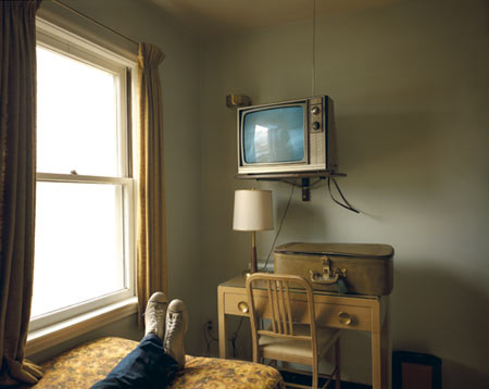
I saw this photograph in a photography magazine that I have and I couldn't stop staring at this image. I haven't seen too many directly overhead photographs, especially not any this interesting. The colors in this are wonderful, especially the blue color from the televisions screen and the brown from the room and how they compliment each other. I also like the lamps and how their light shines on the objects in the room and the carpet.
Michael Brian
Source
I have been looking at portraits of people for fitness magazines and running magazines because I have been trying to get in shape again after my recent surgery, and these images really keep me going and inspire me. I saw this image and quite liked it. The composition is nice, and the color from the womans shoes goes well with her sports bra. It is a successful image for people wanting to get in shape and wanting inspiration to start working out. This specific photograph is a person in a plain background.
Dirk Anschutz
Source
A lot of his photography that I saw was close up portraits with studio lighting, but the photographs that he made that were like this, with people in their environment really intrigued me the most, and I found them the most beautiful. The muted colors in this photograph are so beautiful, and how the ground looks like a huge mirror and reflects the bikes and the people on them. It's breathtaking.
Jen Judge
Source
I found this image interesting because of the selective focus on the scuba gear, and how the wrinkles from the subject look against the glass. This is a portrait of someone in their environment, but also with a plain background. There was another portrait of this person actually working in this scuba gear, but I found this one to be more interesting because of the muted colors, and how the red pops with them. I also quite enjoyed the composition as well.
Friday, April 20, 2012
Friday, March 23, 2012
Color - Week 10
Christopher Thomas
Photo Source
This photographer has a series on NYC and what the city looks like when there is no one around, or it is very desolate. This series is absolutely beautiful, and I have been intrigued by the idea since I came across his work. I also think the way he uses the borders of the photographs and makes them antique-looking is a beautiful way to incorporate the entire idea. I think I also chose this photographer because I miss black and white quite a lot, and the way he shoots, especially in this image, makes me miss it even more. The fog in this photograph and the light is quite beautiful, and reminds me of a dream.
Philipp Klinger
Photo Source
I saw his work in a magazine of mine and absolutely loved the way he photographed stairs. I think it's quite incredible the angles and compositions he uses to compile these structures, and I also like the images because I have always found staircases to be interesting. The colors in the images; including this one, are quite incredible as well. I like the blue and orange, and how vibrant the sky is against the dark staircase that leads the viewers eye up to the sky itself. I believe that using the wide-angle lens worked to his advantage with these images and what he was shooting, and the shadows on the ground and light from the windows really adds to the photograph quite nicely.
Paul Marcellini
Photo Source
With this series, Marcellini has been shooting animals, like this jellyfish, on a white background with really flat/bright studio lighting. He has been compared to Avedon, and even though Marcellini's work is incredible, I don't think that just because the photos for this series are in a studio, and the lighting is flat with a black backround, makes Marcellini like Richard Avedon. This is my favorite image by Marcellini, mostly because the colors really pop and are incredibly beautiful. You start to look at nature and wildlife in a different way with these images and I absolutely love that, especially since I love nature photography.
Photo Source
This photographer has a series on NYC and what the city looks like when there is no one around, or it is very desolate. This series is absolutely beautiful, and I have been intrigued by the idea since I came across his work. I also think the way he uses the borders of the photographs and makes them antique-looking is a beautiful way to incorporate the entire idea. I think I also chose this photographer because I miss black and white quite a lot, and the way he shoots, especially in this image, makes me miss it even more. The fog in this photograph and the light is quite beautiful, and reminds me of a dream.
Philipp Klinger
Photo Source
I saw his work in a magazine of mine and absolutely loved the way he photographed stairs. I think it's quite incredible the angles and compositions he uses to compile these structures, and I also like the images because I have always found staircases to be interesting. The colors in the images; including this one, are quite incredible as well. I like the blue and orange, and how vibrant the sky is against the dark staircase that leads the viewers eye up to the sky itself. I believe that using the wide-angle lens worked to his advantage with these images and what he was shooting, and the shadows on the ground and light from the windows really adds to the photograph quite nicely.
Paul Marcellini
Photo Source
With this series, Marcellini has been shooting animals, like this jellyfish, on a white background with really flat/bright studio lighting. He has been compared to Avedon, and even though Marcellini's work is incredible, I don't think that just because the photos for this series are in a studio, and the lighting is flat with a black backround, makes Marcellini like Richard Avedon. This is my favorite image by Marcellini, mostly because the colors really pop and are incredibly beautiful. You start to look at nature and wildlife in a different way with these images and I absolutely love that, especially since I love nature photography.
Wednesday, March 14, 2012
Color - Week 9.
Emory Kristof
Photo source
The majority of images I found that were by Emory Kristof were photographs taken under the ocean, and photographs of the Titanic. These photographs intigued me because I have been really fascinated by the way the ocean looks from fathoms below while sinking, or even the way it looks from under the surface in general from the human perspective. I love the photographs Kristof has taken underneath of the ocean. They are magical and definitely remind me a dream or something made up; something that isn't real, and that is why I love them so much.
Thomas Struth
Photo source
I have seen a lot of his photography. I absolutely love his photographs of the ship yards, and also interiors. I found this photograph to be incredibly interesting to me. I have seen the majority of this work, and this on stands out to me for some reason. I guess it may be the lighting, but the detail in the floor, and the machines is absolutely incredible, and I fell in love with this photograph on the spot. I also really enjoy the composition and camera positioning.
Lynn Johnson
Photo source
I absolutely love this photograph. It's very simple, but the message is powerful and gives me goosebumps. The link between young and old is obvious, and the way the elders hand rests on the child's face to show the wrinkles and worn skin against the new skin, and to show new life and old life is amazing. I also really enjoy how the red from the clothes the child is wearing is seen in the child's lips and the head piece.
Photo source
The majority of images I found that were by Emory Kristof were photographs taken under the ocean, and photographs of the Titanic. These photographs intigued me because I have been really fascinated by the way the ocean looks from fathoms below while sinking, or even the way it looks from under the surface in general from the human perspective. I love the photographs Kristof has taken underneath of the ocean. They are magical and definitely remind me a dream or something made up; something that isn't real, and that is why I love them so much.
Thomas Struth
Photo source
I have seen a lot of his photography. I absolutely love his photographs of the ship yards, and also interiors. I found this photograph to be incredibly interesting to me. I have seen the majority of this work, and this on stands out to me for some reason. I guess it may be the lighting, but the detail in the floor, and the machines is absolutely incredible, and I fell in love with this photograph on the spot. I also really enjoy the composition and camera positioning.
Lynn Johnson
Photo source
I absolutely love this photograph. It's very simple, but the message is powerful and gives me goosebumps. The link between young and old is obvious, and the way the elders hand rests on the child's face to show the wrinkles and worn skin against the new skin, and to show new life and old life is amazing. I also really enjoy how the red from the clothes the child is wearing is seen in the child's lips and the head piece.
Friday, March 9, 2012
Color - Week 8.
James Balog
Photo Source
This week I am going to be doing my blogs on photographers who are from National Geographic. I have always admired their work, and I too want to work for NG someday, so it is nice to see what they are doing. I have always loved nature photography, and this picture is absolutely beautiful. I hope to travel all over the world when I get out of college. I am fascinated with the blue in the sky, the pink, and purples in this picture, and how those colors reflect off of the ice. I think the triangle shape in-between the glaciers adds something to the photograph.
Lynsey Addario
Photo Source
This picture is my favorite picture of hers. She mainly shoots in the Middle East, involving the life there and also the war going on, but this photograph seems so much more peaceful compared to the others. The blue of their wardrobe that mirrors the color of the sky perfectly is absolutely beautiful, and how the color of the landscape flows together nicely with that blue, the white of the clouds, and the little bit of green in the picture. The composition is very strong in this photograph, and so is the subject.
Jim Brandenburg
Photo source
I am definitely a sucker for photographs like this. This photograph holds true beauty, and it is insanely captivating. The photograph almost looks black and white, and then this explosion of color lights up the center of the photograph with the leaves being in the stream. The stream almost looks like a completely different world compared to the one that is being photographed, because in the string it still remains autumn, and outside of that stream, the world has moved on to winter. This photograph is absolutely incredible.
Photo Source
This week I am going to be doing my blogs on photographers who are from National Geographic. I have always admired their work, and I too want to work for NG someday, so it is nice to see what they are doing. I have always loved nature photography, and this picture is absolutely beautiful. I hope to travel all over the world when I get out of college. I am fascinated with the blue in the sky, the pink, and purples in this picture, and how those colors reflect off of the ice. I think the triangle shape in-between the glaciers adds something to the photograph.
Lynsey Addario
Photo Source
This picture is my favorite picture of hers. She mainly shoots in the Middle East, involving the life there and also the war going on, but this photograph seems so much more peaceful compared to the others. The blue of their wardrobe that mirrors the color of the sky perfectly is absolutely beautiful, and how the color of the landscape flows together nicely with that blue, the white of the clouds, and the little bit of green in the picture. The composition is very strong in this photograph, and so is the subject.
Jim Brandenburg
Photo source
I am definitely a sucker for photographs like this. This photograph holds true beauty, and it is insanely captivating. The photograph almost looks black and white, and then this explosion of color lights up the center of the photograph with the leaves being in the stream. The stream almost looks like a completely different world compared to the one that is being photographed, because in the string it still remains autumn, and outside of that stream, the world has moved on to winter. This photograph is absolutely incredible.
Thursday, March 1, 2012
Color - Week 7, take 2
This photograph was for assignment four, and I found it absolutely beautiful as well as the writing written next to it. I guess that is because I accompany writing with my work, so a lot of photographers that do that, their work always affects me greatly. I thought that this assignment was amazing, and some of the writing that people used was really intriguing. I absolutely love the lighting in this piece, and how the blue is echoed in the background for the writing. Source
This was for assignment three. I may actually want to do this sometime. The assignment shows how perspective and photographs can change due to the person taking the picture, and their knowledge for the art, and also how they think and see things. I was instantly drawn to the photograph on the bottom. I love the grain and how dark the photograph is overall, and also how you cannot make out the figure quite so well, but you still know it is a person in a space. Source
It is very difficult to take a picture of a complete stranger and make it beautiful, but this photograph is incredible and very breath taking. I think this was the only photograph that actually caught my attention in assignment two. I love the shadows on the stairs, but also the composition and how the figure is in the bottom right corner of the photograph. I also enjoy the pose he is in, and how the yellow from his jacket flows nicely with the color of his shoes, pants, and the color of the bleachers. Source
This photograph was for assignment one, I think the idea of scavenger hunts can be fun, and of course, can help people become inspired, but I didn't like this assignment as much as the others. I love this photograph. The way the figure is running, and how the light touches the figure is absolutely wonderful, as well as the trash on the sidewalk. The color from the window across the street also adds to this photograph, as well as the vantage point. Great use of point of view. source
Color - Week 7.
Michael Eastman
Photo Source
This is probably my favorite photograph of his. I love how muted the colors are in this photograph, and how ominous the sky looks behind it. The composition is very successful, especially because the building is placed directly in the center of the photograph. I also really love how the yellow, blue, and red work perfectly well together, and the way the building is corroding is a nice aspect and touch.
Zoe Strauss
Photo source
I heard about her work in Lenticular Vision and I love it. I don't tend to like street photography too often, but I love the feel of hers, as well as her color palette. The color palette isn't harsh or too bright. I love the way the color of the balloons in this piece go along with some of the colors in the mattresses, as well as the sky, and the patterns. I think the blue tarp in the background adds a lot to this photograph, as well as the yellow lines on the street.
Frieke Janssens
Photo source
CIRCLES! I absolutely love her photography, and the circle portraits of the children are absolutely incredible. I love how she puts people in normal situations, but makes them strange, and surreal. Her editing is absolutely insane as well, and usually I don't like photography that is overly edited, but her editing is absolutely fantastic. I love the way the girls eyes are closed in the photograph as she holds the bent cigarette to the side. Her pink outfit goes very well with the background as well, so that adds a nice touch.
Friday, February 24, 2012
Color - Week 6.
Jay Sauceda
Photo Source
I came across this photographer in one of my many photography magazines that I receive in the mail, and I don't usually like portraits, but I found it really interesting how he photographs people in their natural environment in a really commercial looking way. He mainly shoots around his home in Austin Texas, and it is definitely great to see how many different people are living in one single area. In this photograph I love the lighting that he has used to light the figure and to correspond with the background. I enjoy the composition quite a lot and how the blue from the sky and plane are seen in his jacket.
Ken Kochey
Photo Source
I have seen a bit of his work prior to this diptych, but I honestly think this is one of his greatest photographs. I have always enjoyed diptychs, and of course, when two images go together beautifully, it is incredible to see the impact two images can make standing side by side. The two images go together quite amazingly, especially with the way the blue from the sky in the left picture is matched wonderfully with the blue in the womans wardrobe on the right; it can really make quite a statement.
Brooke Shaden
Photo source
I don't usually tend to like photo manipulated work, but when I saw this image I instantly fell in love with it. Of course, that may have to do with the square format and how beautifully it works with the image and the composition, but I honestly believe this is an incredible piece. The image is edited so nicely you can't tell if it has actually been manipulated. The scene of this image is so surreal, but it is captured and editing in such a beautiful way you almost forget that it isn't real. I love the way the water drops are only seen forming around the figures feet and not in the rest of the water even though her head is covered with an umbrella, it definitely causes me to ask a lot of questions, but I honestly get the feeling and sense that this girl is cursed.
Photo Source
I came across this photographer in one of my many photography magazines that I receive in the mail, and I don't usually like portraits, but I found it really interesting how he photographs people in their natural environment in a really commercial looking way. He mainly shoots around his home in Austin Texas, and it is definitely great to see how many different people are living in one single area. In this photograph I love the lighting that he has used to light the figure and to correspond with the background. I enjoy the composition quite a lot and how the blue from the sky and plane are seen in his jacket.
Ken Kochey
Photo Source
I have seen a bit of his work prior to this diptych, but I honestly think this is one of his greatest photographs. I have always enjoyed diptychs, and of course, when two images go together beautifully, it is incredible to see the impact two images can make standing side by side. The two images go together quite amazingly, especially with the way the blue from the sky in the left picture is matched wonderfully with the blue in the womans wardrobe on the right; it can really make quite a statement.
Brooke Shaden
Photo source
I don't usually tend to like photo manipulated work, but when I saw this image I instantly fell in love with it. Of course, that may have to do with the square format and how beautifully it works with the image and the composition, but I honestly believe this is an incredible piece. The image is edited so nicely you can't tell if it has actually been manipulated. The scene of this image is so surreal, but it is captured and editing in such a beautiful way you almost forget that it isn't real. I love the way the water drops are only seen forming around the figures feet and not in the rest of the water even though her head is covered with an umbrella, it definitely causes me to ask a lot of questions, but I honestly get the feeling and sense that this girl is cursed.
Thursday, February 16, 2012
Color - Week 5 - Take 2

Photo Source
Her work is incredibly fascinating. I have seen photographs like this taken before, but not in this specific way. I love how dark the first two images are, and how you can't tell what exactly the bodies (figures) are submerged in, because it looks like they are simply floating in a black mass. This of course causes me to ask myself a lot of questions as to what the photographs are actually supposed to represent, and if the formations of the figures symbolize anything deeper. The third image caught my eye right away, just because it was different than the first two, and it is not in square format. I like the difference between the last image and the first two, and how you can see the figures and what they are submerged in, rather than them simply being in black space, and you can definitely tell that they are in a pool. The second image reminds me of The Beatles and their later music. Overall, the series is amazing and very different from anything I have ever seen.
Color - Week 5
Patrick (No last name given)
Photo source
He is one of my favorite photographers that I follow on Flickr, if not my absolute favorite. His work reminds me of Stephen Shores, and it is absolutely incredible. I love the way he turns landscapes that are during this time period, into looking like landscapes from the 70s, or even earlier. He uses cars and buildings in a great way to make his photographs seem as if they are from a different decade. The composition of this photograph is very strong, and wouldn't work as well if it wasn't in a square format. I love the way the blue from the car is mimicked in the sky, and how the green from the roof flows together with the blue quite nicely.
Larry Sultan
Photo source
I haven't seen much of Larry Sultan's work until I was viewing it after I read that Todd Hido did an exhibit with him before, and once I saw this photograph I instantly fell in love with Sultan's work. I love the composition in this photograph, and the light from inside of the house, and the positioning of the dog in front of the light reminds me a lot of Crewdson, in a very good way of course, and draws me into the photograph even more. I love the way the side of the house looks purple because of the time of day and how that color goes incredibly with the green on the concrete from the lights inside of the house. This photograph looks like a movie still, and makes me ask a lot of questions. I love the mystery to this as well.
Alec Soth
Photo Source
He has been one of my favorite photographers for a while now, and I absolutely love his photographs of simple objects in a landscape setting. The colors in this flow together incredibly, and I am taken away by the composition and overall beauty of this photograph. I am in love with the fact that the red, white, and blue, of the flag is mimicked in the colors in the furniture. I think it is incredible that Alec Soth can turn something so simple into something completely magical and wonderful.
Photo source
He is one of my favorite photographers that I follow on Flickr, if not my absolute favorite. His work reminds me of Stephen Shores, and it is absolutely incredible. I love the way he turns landscapes that are during this time period, into looking like landscapes from the 70s, or even earlier. He uses cars and buildings in a great way to make his photographs seem as if they are from a different decade. The composition of this photograph is very strong, and wouldn't work as well if it wasn't in a square format. I love the way the blue from the car is mimicked in the sky, and how the green from the roof flows together with the blue quite nicely.
Larry Sultan
Photo source
I haven't seen much of Larry Sultan's work until I was viewing it after I read that Todd Hido did an exhibit with him before, and once I saw this photograph I instantly fell in love with Sultan's work. I love the composition in this photograph, and the light from inside of the house, and the positioning of the dog in front of the light reminds me a lot of Crewdson, in a very good way of course, and draws me into the photograph even more. I love the way the side of the house looks purple because of the time of day and how that color goes incredibly with the green on the concrete from the lights inside of the house. This photograph looks like a movie still, and makes me ask a lot of questions. I love the mystery to this as well.
Alec Soth
Photo Source
He has been one of my favorite photographers for a while now, and I absolutely love his photographs of simple objects in a landscape setting. The colors in this flow together incredibly, and I am taken away by the composition and overall beauty of this photograph. I am in love with the fact that the red, white, and blue, of the flag is mimicked in the colors in the furniture. I think it is incredible that Alec Soth can turn something so simple into something completely magical and wonderful.
Thursday, February 9, 2012
Color - Week 4.
Len Jenshel
Photo source
Ever since we looked at Jenshel's work in class I have really fallen in love with it. I came across this picture and was instantly drawn to it. The way that the background fades from sight because of the fog is absolutely beautiful, and how the brown from the land morphs into blue as you look to the sky. The composition of this piece is very good as well, with the man standing in the front with the billboard. Overall this is a fantastic photograph.
Catherine Opie
Photo source
Catherine Opie has always been one of my favorite photographers, especially her images of the ice houses and the images of the surfers; and this happens to be an image from her series of surfers. Surfers always tend to be photographed in a particular way, and she captured them in a way I have never seen them captured before, and it is quite beautiful. I love the way the sky meets the ocean, and how it looks like there is no difference between the two.
Natalie Kucken
Photo source
I have known of Natalie's work for a short time now, but her photographs are absolutely incredible. All of her photography is very surreal, and reminds me of dreams, especially the photographs she takes of the children. There is always a mystery to them that captivates me. The colors in this photograph flow together nicely, and the light in the foreground makes me ask a lot of questions.
Photo source
Ever since we looked at Jenshel's work in class I have really fallen in love with it. I came across this picture and was instantly drawn to it. The way that the background fades from sight because of the fog is absolutely beautiful, and how the brown from the land morphs into blue as you look to the sky. The composition of this piece is very good as well, with the man standing in the front with the billboard. Overall this is a fantastic photograph.
Catherine Opie
Photo source
Catherine Opie has always been one of my favorite photographers, especially her images of the ice houses and the images of the surfers; and this happens to be an image from her series of surfers. Surfers always tend to be photographed in a particular way, and she captured them in a way I have never seen them captured before, and it is quite beautiful. I love the way the sky meets the ocean, and how it looks like there is no difference between the two.
Natalie Kucken
Photo source
I have known of Natalie's work for a short time now, but her photographs are absolutely incredible. All of her photography is very surreal, and reminds me of dreams, especially the photographs she takes of the children. There is always a mystery to them that captivates me. The colors in this photograph flow together nicely, and the light in the foreground makes me ask a lot of questions.
Tuesday, January 31, 2012
Color - Week 3. Stephen Shore
This was the first photograph of Stephen Shore's that really caught my attention, and I guess that is because this photograph reminds me of my favorite Todd Hido photograph. I instantly fell in love with the muted colors, and how the same brown/earth tone flows throughout the entire image. I also really enjoy how the legs and shoes lead my eyes into the photograph to see the blue on the television screen, and the blue in the jeans. I also really like how you cannot see any information from outside of the window, that there is only light shining through.
Photo source
This definitely has to be my second favorite Stephen Shore photograph. The way he can have several colors flow throughout a photograph in a pleasing way is incredible. I absolutely love how the green of the car is seen throughout the image (on the sign, corn, and boxes), and I also really enjoy how the red is seen throughout the photograph as well as the yellow/orange (boxes, building, door, truck, and onions). I think the way he left the doors of the vehicles and the building open adds a lot to the photograph as well, and makes the photograph more interesting. The way the doors are open adds mystery to the image overall.
Photo source
This is the image I chose of Stephen Shore's that I didn't find as interesting as the others. This is an average image, sure it's not horrible, but I have seen images like this before, there isn't anything spectacular about it. The atmospheric perspective is nice, but there is nothing that makes me excited about this image.
Photo source
Photo source
This definitely has to be my second favorite Stephen Shore photograph. The way he can have several colors flow throughout a photograph in a pleasing way is incredible. I absolutely love how the green of the car is seen throughout the image (on the sign, corn, and boxes), and I also really enjoy how the red is seen throughout the photograph as well as the yellow/orange (boxes, building, door, truck, and onions). I think the way he left the doors of the vehicles and the building open adds a lot to the photograph as well, and makes the photograph more interesting. The way the doors are open adds mystery to the image overall.
Photo source
This is the image I chose of Stephen Shore's that I didn't find as interesting as the others. This is an average image, sure it's not horrible, but I have seen images like this before, there isn't anything spectacular about it. The atmospheric perspective is nice, but there is nothing that makes me excited about this image.
Photo source
Wednesday, January 25, 2012
Color - Week 2
Joel Sternfeld
Photo Source
I have seen a lot of his work, but mostly his portraits. I found a book of his in the library containing his landscape work, and I must admit, I like his landscape photography more than his portraits. I love the way the same two colors (brown a green) move throughout the entire photograph. The colors of the house mimics the beauty of the earth because of the colors, which is ironic, because the house is manmade. The house is now abandoned, or looks abandoned, and will now become a part of the earth itself.
Gilbert Terrazas
Photo Source
This photograph leaves me with the feeling of absence; something being missing, or taken away that used to belong in this place that was photographed. I love how simple the colors our, and how muted. The bright lights from inside of the building that lead onto the ground is absolutely incredible. The simplicity of this image is what makes it so beautiful.
Anna Gaskell
Photo Source
All of her work reminds me of nightmares, dangerous plots being planned, and mischievous activities. This one reminds me of children dragging away Alice to Wonderland, or dragging her away. All of her photographs have this dark and surreal quality to them, and they really are incredible. I found a book of her work in the library as well and I fell in love with it.
Photo Source
I have seen a lot of his work, but mostly his portraits. I found a book of his in the library containing his landscape work, and I must admit, I like his landscape photography more than his portraits. I love the way the same two colors (brown a green) move throughout the entire photograph. The colors of the house mimics the beauty of the earth because of the colors, which is ironic, because the house is manmade. The house is now abandoned, or looks abandoned, and will now become a part of the earth itself.
Gilbert Terrazas
Photo Source
This photograph leaves me with the feeling of absence; something being missing, or taken away that used to belong in this place that was photographed. I love how simple the colors our, and how muted. The bright lights from inside of the building that lead onto the ground is absolutely incredible. The simplicity of this image is what makes it so beautiful.
Anna Gaskell
Photo Source
All of her work reminds me of nightmares, dangerous plots being planned, and mischievous activities. This one reminds me of children dragging away Alice to Wonderland, or dragging her away. All of her photographs have this dark and surreal quality to them, and they really are incredible. I found a book of her work in the library as well and I fell in love with it.
Thursday, January 19, 2012
Color - Week 1.
Marcus Claesson
Untitled
Photo source
I have always been a fan of his work, ever since I came across his photo-stream on Flickr. His work reminds me of Michael Kenna's work, mainly because of the weather situations they both use, and the vast space in their photographs, and with the added knowledge for specific detail. This is one of my favorite photographs that Marcus has ever taken. The foreground leads the viewers eyes into the photograph and the center point, which is the light being swallowed by the fog. The photograph doesn't have any saturated colors, and the mood of the image as a whole is definitely a calm one. The photograph also seems very quiet with the fog present.
Nan Goldin
Photo Source
This photograph instantly caught my eye. I love the way the soft blues and browns flow together nicely with the subject matters skin tone. The murky bath water also adds a nice touch to the photograph. While looking a this photograph it almost makes me feel as if I am intruding on a private and personal thought, especially since the subjects eyes are closed and the camera is from a higher position and angle. The positioning of the hands also give this feeling of a 'private moment', as if the subject is in deep thought or calm and at ease.
Todd Hido
Photo Source
The flow of this whole photograph is absolutely incredible. The blue that engulfs the majority of this photograph is touched by the light coming from inside of the house, and from the road. The yellow light that glows goes well with the blue from the snow and the sky, and helps the viewers eye to see a certain part of the photograph, which is the light coming from the windows of the house, and this light seems to circle the house because of the lights from the road and the houses in the difference. The composition was well thought out, as well as the exposure.
Subscribe to:
Posts (Atom)