Thursday, February 16, 2012

Color - Week 5 - Take 2


 Catharine Maloney
Photo Source
Her work is incredibly fascinating. I have seen photographs like this taken before, but not in this specific way. I love how dark the first two images are, and how you can't tell what exactly the bodies (figures) are submerged in, because it looks like they are simply floating in a black mass. This of course causes me to ask myself a lot of questions as to what the photographs are actually supposed to represent, and if the formations of the figures symbolize anything deeper. The third image caught my eye right away, just because it was different than the first two, and it is not in square format. I like the difference between the last image and the first two, and how you can see the figures and what they are submerged in, rather than them simply being in black space, and you can definitely tell that they are in a pool. The second image reminds me of The Beatles and their later music. Overall, the series is amazing and very different from anything I have ever seen.

Color - Week 5

Patrick (No last name given)
Photo source
He is one of my favorite photographers that I follow on Flickr, if not my absolute favorite. His work reminds me of Stephen Shores, and it is absolutely incredible. I love the way he turns landscapes that are during this time period, into looking like landscapes from the 70s, or even earlier. He uses cars and buildings in a great way to make his photographs seem as if they are from a different decade. The composition of this photograph is very strong, and wouldn't work as well if it wasn't in a square format. I love the way the blue from the car is mimicked in the sky, and how the green from the roof flows together with the blue quite nicely.


Larry Sultan
Photo source
I haven't seen much of Larry Sultan's work until I was viewing it after I read that Todd Hido did an exhibit with him before, and once I saw this photograph I instantly fell in love with Sultan's work. I love the composition in this photograph, and the light from inside of the house, and the positioning of the dog in front of the light reminds me a lot of Crewdson, in a very good way of course, and draws me into the photograph even more. I love the way the side of the house looks purple because of the time of day and how that color goes incredibly with the green on the concrete from the lights inside of the house. This photograph looks like a movie still, and makes me ask a lot of questions. I love the mystery to this as well.

Alec Soth
Photo Source
He has been one of my favorite photographers for a while now, and I absolutely love his photographs of simple objects in a landscape setting. The colors in this flow together incredibly, and I am taken away by the composition and overall beauty of this photograph. I am in love with the fact that the red, white, and blue, of the flag is mimicked in the colors in the furniture. I think it is incredible that Alec Soth can turn something so simple into something completely magical and wonderful.

Thursday, February 9, 2012

Color - Week 4.

Len Jenshel
Photo source
Ever since we looked at Jenshel's work in class I have really fallen in love with it. I came across this picture and was instantly drawn to it. The way that the background fades from sight because of the fog is absolutely beautiful, and how the brown from the land morphs into blue as you look to the sky. The composition of this piece is very good as well, with the man standing in the front with the billboard. Overall this is a fantastic photograph.


Catherine Opie
Photo source
Catherine Opie has always been one of my favorite photographers, especially her images of the ice houses and the images of the surfers; and this happens to be an image from her series of surfers. Surfers always tend to be photographed in a particular way, and she captured them in a way I have never seen them captured before, and it is quite beautiful. I love the way the sky meets the ocean, and how it looks like there is no difference between the two.


Natalie Kucken
Photo source
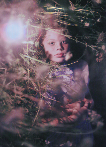
I have known of Natalie's work for a short time now, but her photographs are absolutely incredible. All of her photography is very surreal, and reminds me of dreams, especially the photographs she takes of the children. There is always a mystery to them that captivates me. The colors in this photograph flow together nicely, and the light in the foreground makes me ask a lot of questions.

Tuesday, January 31, 2012

Color - Week 3. Stephen Shore

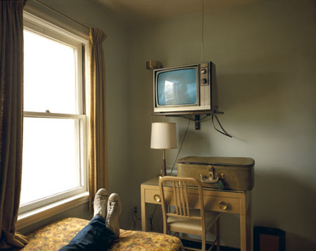
This was the first photograph of Stephen Shore's that really caught my attention, and I guess that is because this photograph reminds me of my favorite Todd Hido photograph. I instantly fell in love with the muted colors, and how the same brown/earth tone flows throughout the entire image. I also really enjoy how the legs and shoes lead my eyes into the photograph to see the blue on the television screen, and the blue in the jeans. I also really like how you cannot see any information from outside of the window, that there is only light shining through.

Photo source


This definitely has to be my second favorite Stephen Shore photograph. The way he can have several colors flow throughout a photograph in a pleasing way is incredible. I absolutely love how the green of the car is seen throughout the image (on the sign, corn, and boxes), and I also really enjoy how the red is seen throughout the photograph as well as the yellow/orange (boxes, building, door, truck, and onions). I think the way he left the doors of the vehicles and the building open adds a lot to the photograph as well, and makes the photograph more interesting. The way the doors are open adds mystery to the image overall.

Photo source

This is the image I chose of Stephen Shore's that I didn't find as interesting as the others. This is an average image, sure it's not horrible, but I have seen images like this before, there isn't anything spectacular about it. The atmospheric perspective is nice, but there is nothing that makes me excited about this image.

Photo source

Wednesday, January 25, 2012

Color - Week 2

Joel Sternfeld
Photo Source
I have seen a lot of his work, but mostly his portraits. I found a book of his in the library containing his landscape work, and I must admit, I like his landscape photography more than his portraits. I love the way the same two colors (brown a green) move throughout the entire photograph. The colors of the house mimics the beauty of the earth because of the colors, which is ironic, because the house is manmade. The house is now abandoned, or looks abandoned, and will now become a part of the earth itself.


Gilbert Terrazas
Photo Source
This photograph leaves me with the feeling of absence; something being missing, or taken away that used to belong in this place that was photographed. I love how simple the colors our, and how muted. The bright lights from inside of the building that lead onto the ground is absolutely incredible. The simplicity of this image is what makes it so beautiful. 


Anna Gaskell 
Photo Source
All of her work reminds me of nightmares, dangerous plots being planned, and mischievous activities. This one reminds me of children dragging away Alice to Wonderland, or dragging her away. All of her photographs have this dark and surreal quality to them, and they really are incredible. I found a book of her work in the library as well and I fell in love with it. 

Thursday, January 19, 2012

Color - Week 1.

Marcus Claesson
Untitled
Photo source

I have always been a fan of his work, ever since I came across his photo-stream on Flickr. His work reminds me of Michael Kenna's work, mainly because of the weather situations they both use, and the vast space in their photographs, and with the added knowledge for specific detail. This is one of my favorite photographs that Marcus has ever taken. The foreground leads the viewers eyes into the photograph and the center point, which is the light being swallowed by the fog. The photograph doesn't have any saturated colors, and the mood of the image as a whole is definitely a calm one. The photograph also seems very quiet with the fog present.

Nan Goldin
Photo Source

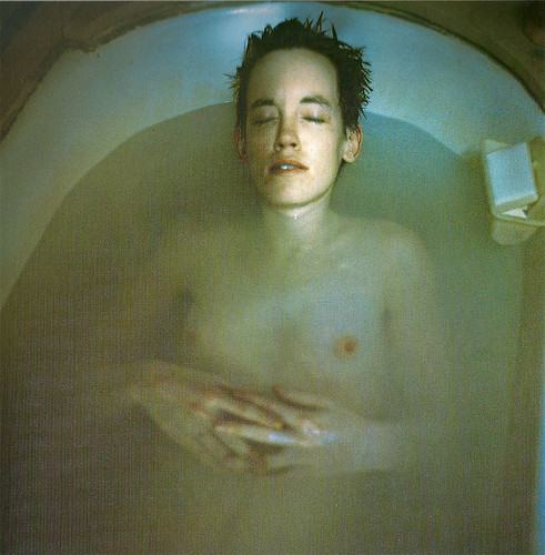
This photograph instantly caught my eye. I love the way the soft blues and browns flow together nicely with the subject matters skin tone. The murky bath water also adds a nice touch to the photograph. While looking a this photograph it almost makes me feel as if I am intruding on a private and personal thought, especially since the subjects eyes are closed and the camera is from a higher position and angle. The positioning of the hands also give this feeling of a 'private moment', as if the subject is in deep thought or calm and at ease.


Todd Hido
Photo Source

The flow of this whole photograph is absolutely incredible. The blue that engulfs the majority of this photograph is touched by the light coming from inside of the house, and from the road. The yellow light that glows goes well with the blue from the snow and the sky, and helps the viewers eye to see a certain part of the photograph, which is the light coming from the windows of the house, and this light seems to circle the house because of the lights from the road and the houses in the difference. The composition was well thought out, as well as the exposure.

Tuesday, December 13, 2011

Week 16.

Last blog for the Semester!
For this last blog I'm going to post three images from my three favorite photographers.

Ralph Eugene Meatyard
This is one of my favorite photographs by him. The selective focus is beautiful, but not only that but the quality is beautiful from the film, and the dark and light tones are incredible. The contrast between the different branches and the way the branches lead your eyes into the picture, and through the entire image as a whole. The way the branch curves also adds to this photograph. 


Michael Kenna
I have really been interested in square-formatted photographs recently, and this photograph is my favorite photograph that Michael Kenna has taken. The fog that flows through the trees is incredible, and also very beautiful. The feeling of nostalgia in this photograph is very strong, and this photograph is very emotional for me because it reminds me of events from my past. I love how the trees reach out to the skies as if they are in agony, and this feeling is brought out by the fog.

Uta Barth
Uta is also another one of my favorite photographers and has given me a lot of inspiration. Even though this photograph is simple, it becomes incredibly complex in its simplicity. The light coming from the windows is incredible, and the shape of windows also adds a lot to this photograph. The edge of the room and the line of the floor is incredible as well, and the dull colors in the photograph flow together very nicely and form as one.